The Importance of Book Covers
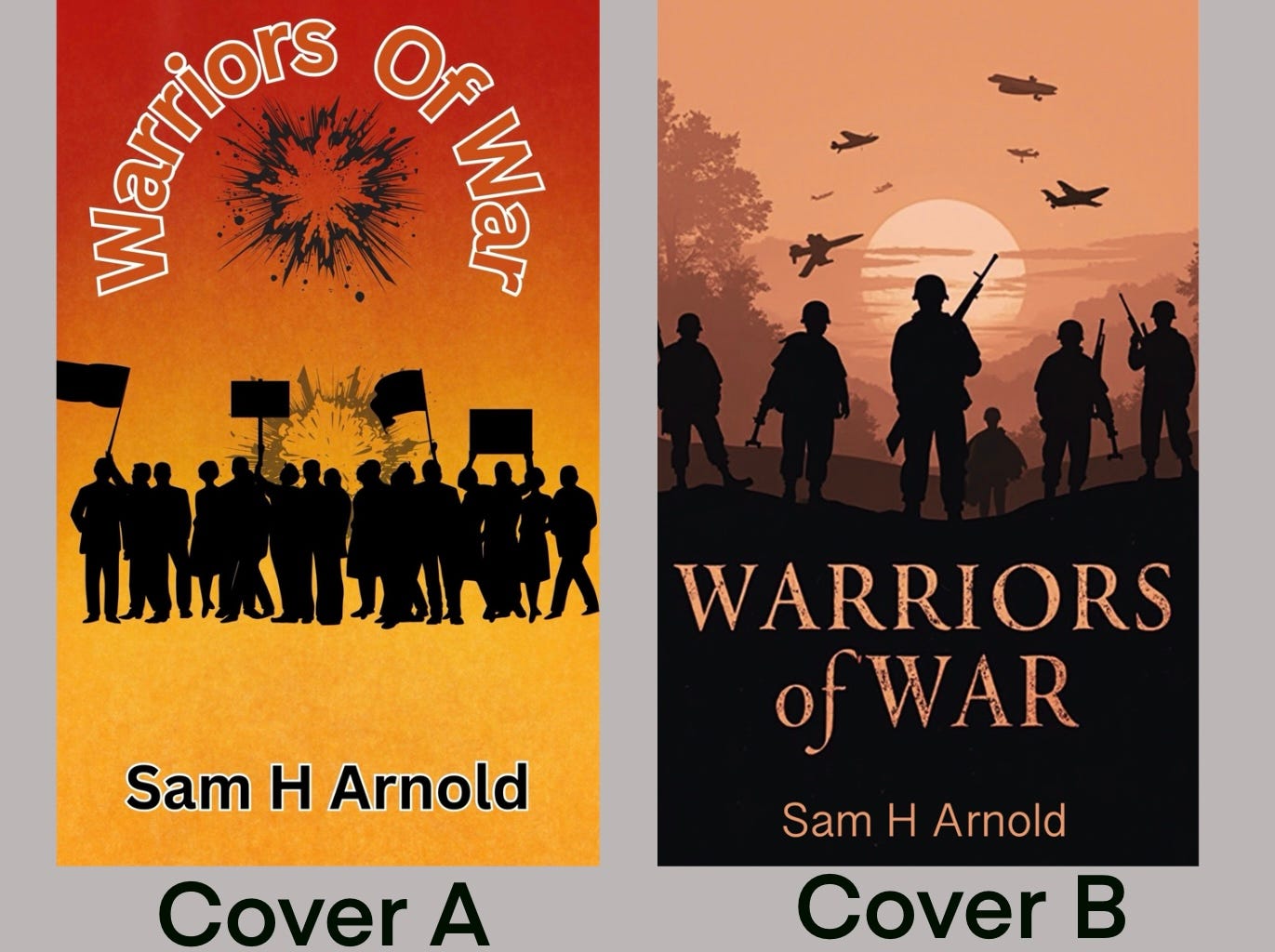
Help me choose the my next cover.
One piece of advice that Nicholas Cole gives on numerous occasions is that if you spend money on anything when writing a book, make it the cover. A cover is the difference between a book's success and failure.
Bookworms worldwide will try to tell me that they do not judge a book by its cover, but let us be honest with ourselves. We all do.
The imagery should demonstrate the book's tone and genre, whether it's an illustration, photograph, or minimalist design. Colours should complement the mood—bold for thrillers, soft for romance, dark for horror
The title, author name, and tagline should be clear and readable, with a balanced layout that draws the eye naturally. Use contrast, spacing, and font choice wisely.
So, with that in mind, the wonderful Edward Anderson and I have designed a cover each, and we would like you to pick the winner. We are not going to tell you who designed which image. Look at the images below and pick which one you are drawn to.
Until next week stay safe
Sam 😊
A book cover is not just a wrapper; it is an invitation. - Margaret Atwood


What colours and styles would you associate with historical fiction or a his fic / lit fic hybrid ?
I vote for A